Blog
How to Create a Histogram in Excel: Fix Bin Settings and Read Distribution Correctly

A histogram shows how values are distributed across intervals. It is different from a bar chart because the horizontal axis represents numeric ranges, not categories. If you want to understand score distribution, delivery time spread, order size patterns, or defect measurements, a histogram is often the right chart.
The most important part is bin design. Bad bins can make the same data look stable, scattered, or misleading.
What a Histogram Shows
A histogram groups numeric values into ranges called bins. Each bar shows how many values fall into that range. The shape helps you see whether values cluster near the center, spread evenly, skew to one side, or include outliers.
Use a histogram when the question is about distribution, not category comparison.
Prepare the Data
Start with one clean numeric column. Remove text values, blanks that should not be counted, and error values. If numbers are stored as text, convert them first.
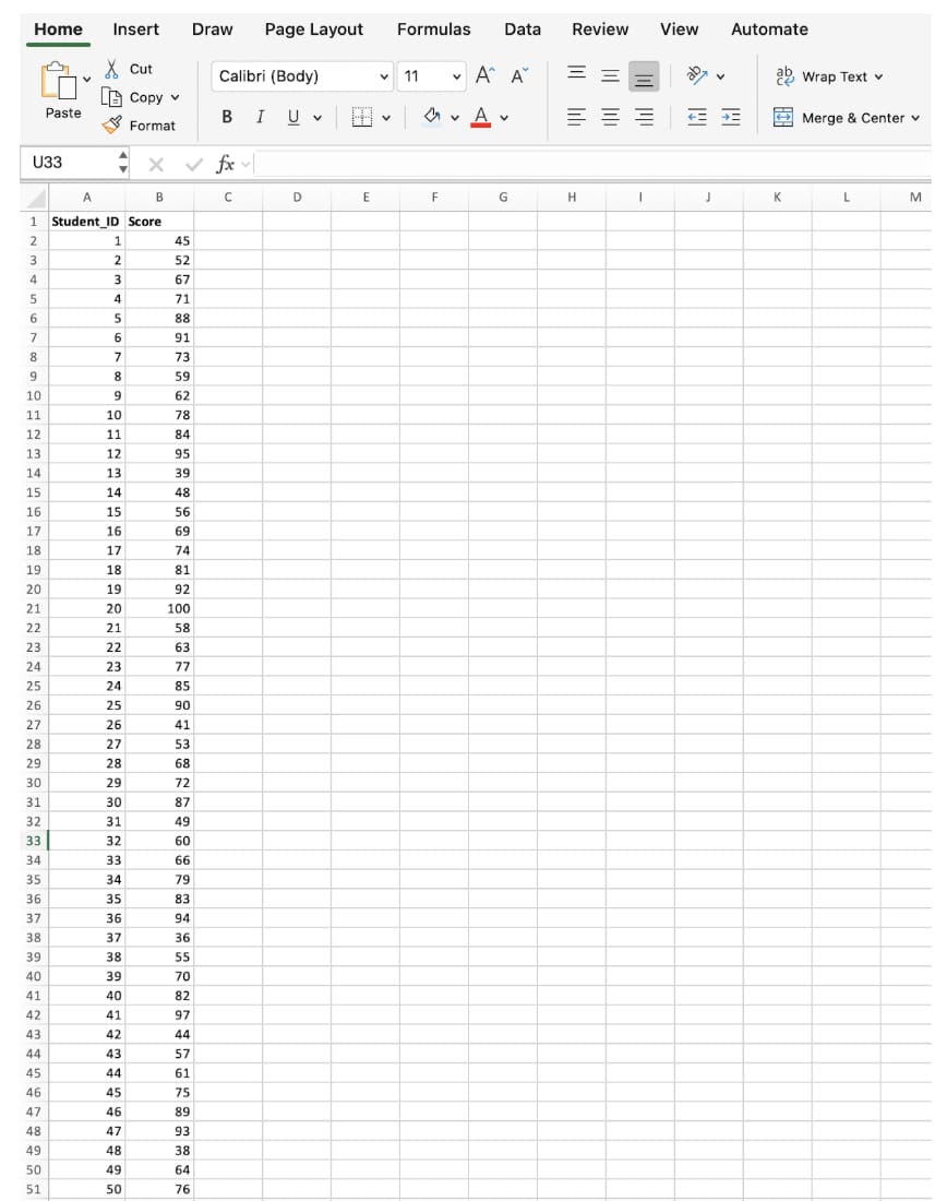
Do not include totals or summary rows in the selected range.
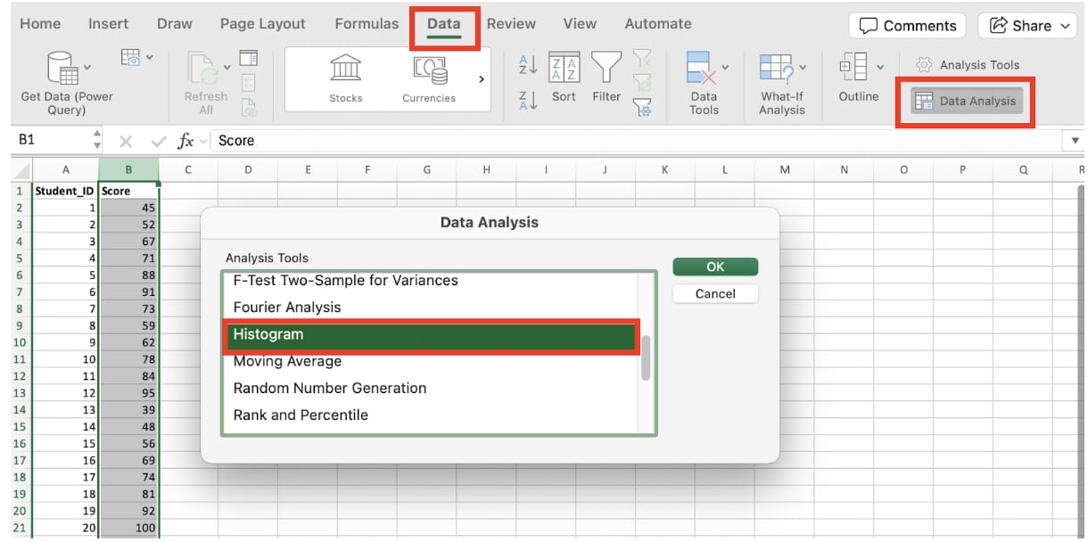
Insert a Histogram in Excel
Select the numeric data, go to Insert, open the statistical chart options, and choose Histogram. Excel will create a default histogram automatically.
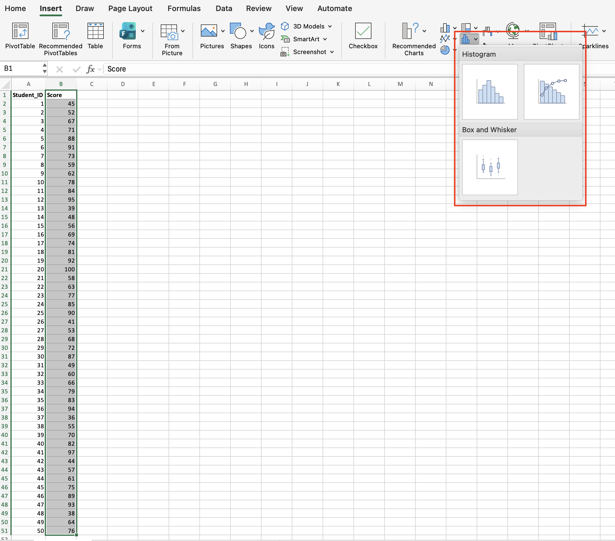
The default chart is only a starting point. You should almost always review the bin settings.
Adjust Bin Width
Right-click the horizontal axis and open Format Axis. Use Bin width when you want every interval to have a fixed size, such as 10 points or 100 dollars.
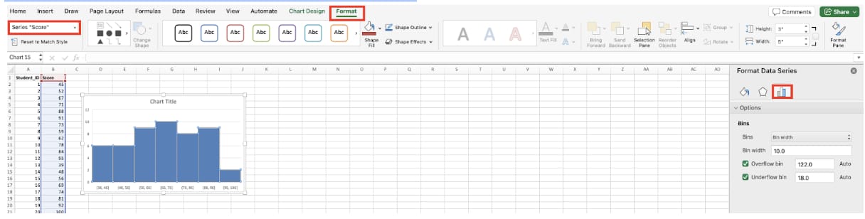
If the bin width is too large, important variation disappears. If it is too small, the chart becomes noisy and hard to read.
Set the Number of Bins
You can also choose the number of bins. This is useful when you know how many groups will communicate the distribution clearly.
For reports, fewer clear bins are usually better than many tiny bins.
Fix Missing Maximum Values
Sometimes the largest value appears to be missing because the bin boundary does not include it the way you expect. Check overflow bin settings and axis boundaries when the rightmost values look wrong.
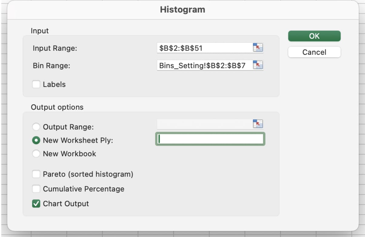
Use an overflow bin when values above a threshold should be grouped together, such as 100+ or 1,000+.
Histogram vs Bar Chart
A bar chart compares named categories like Region A, Region B, and Region C. A histogram shows numeric intervals like 0 to 10, 10 to 20, and 20 to 30. Do not use a bar chart when you need to analyze the shape of a numeric distribution.
How to Interpret the Shape
A tall center with lower bars on both sides suggests values cluster around the average. A long right tail suggests a few unusually high values. Multiple peaks may mean your data contains more than one group and should be segmented before analysis.
Practical Tips
Label the axis with units, explain the bin width, and avoid decorative colors. If the histogram supports a decision, state the practical takeaway clearly: most delivery times are under 3 days, most scores are between 70 and 85, or a small number of outliers drive the average upward.
Extend Excel Histogram Analysis with inline AI
Once you know how to create a histogram in Excel, the next step is automating repeated distribution analysis. Wouldn't it be easier to set bins, update frequency tables, and rebuild charts without doing the same setup every time?
inline AI is a local agent that works directly inside Excel. Ask in natural language, such as create a histogram and explain the distribution, and it can read and edit your Excel file in real time.
Because it runs locally on your PC without uploading your data to the cloud, it can handle sensitive spreadsheets more safely. Download it today and experience the future of Excel work yourself.
Download your AI Coworker for Excel