Learn
Character Spacing in PowerPoint: Tighten Titles by Exact pt

Dropping the font size is the wrong reaction to a title whose letters look too far apart. Smaller type keeps the same spacing ratio, so the title still reads as loose, and now it competes badly with the body text underneath. Character spacing in PowerPoint is the setting that actually fixes this, and there are two ways in: a five-preset gallery on the Home tab for a one-click change, and the Font dialog when you want a value down to 0.1pt. Below are both routes, the pt values worth starting from, and the checks to run when the spacing refuses to budge.
The screenshots use a five-slide deck: a title slide reading Second-Half Brand Renewal Plan, then Background, Rollout Order by Channel, Schedule and Owners, and Next Steps.
What character spacing is, and what it is not
Spacing, leading, and letter width
Character spacing is the horizontal gap between letters. PowerPoint labels it exactly that: Character Spacing. Line spacing is the vertical gap between lines, and letter width is the horizontal proportion of the glyphs themselves.
Mixing the three up means adjusting the wrong control. Worth knowing up front: PowerPoint has no option to compress letter width to a percentage. If the letterforms themselves are too wide, swapping in a narrow typeface is the accurate fix, not spacing.
Three situations where spacing looks worst
Large titles over 40pt are the usual offender. Default spacing scales with type size, so a gap that looks natural at 18pt looks like a gap at 44pt.
Mixed or substituted fonts are the second. When a font does not contain every glyph in the text, the missing ones are drawn from a fallback face, and the widths stop matching. The third is justified alignment, which stretches the gaps to fill each line, so tightening the spacing value produces almost no visible change.
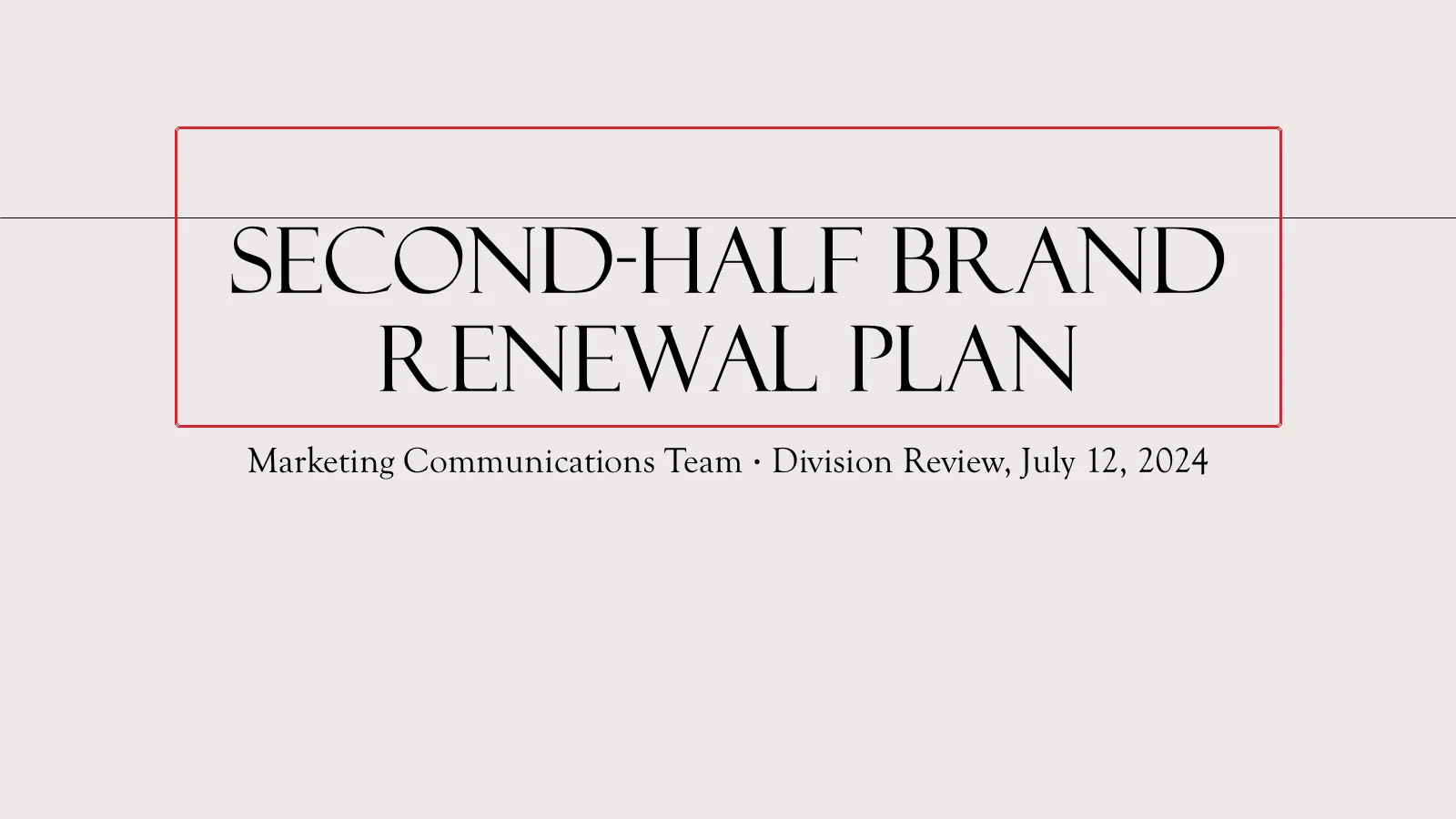
What tightening actually buys you
The same words, pulled in slightly, read as a single block instead of a row of separate letters. Neither the wording nor the size changes — only the gaps between the letters close, and the title starts to hold together.
As a starting point, a large title only needs 0.5 to 1pt of tightening. Push much past that and letters start colliding, especially in bold weights and in fonts with generous strokes.
Check what you have selected before changing anything
Object border versus a text block
Spacing that lands on only part of a line is nearly always a selection problem. Drag-select a run of text and the value applies to that run alone. Click the placeholder border so the selection handles appear, and every character inside it changes at once.
With the cursor sitting inside the text, Ctrl+A selects all the text in that one object. Click empty slide space with no cursor active and Ctrl+A selects every object on the slide instead. The two results are different, so glance at where the selection markers land before you apply anything.
Look at the font and size first
Sometimes the font is the real problem. Select the title placeholder and the Home tab shows the current typeface in the Font box.
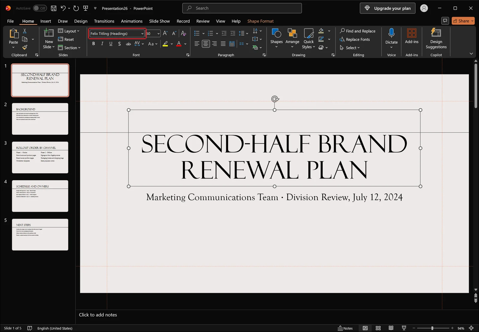
If what appears there is a system default or a face that does not suit display type, changing it can remove the loose feeling on its own, before you touch spacing at all.
Body text is the opposite case. Select the body placeholder and read the Font Size value first.
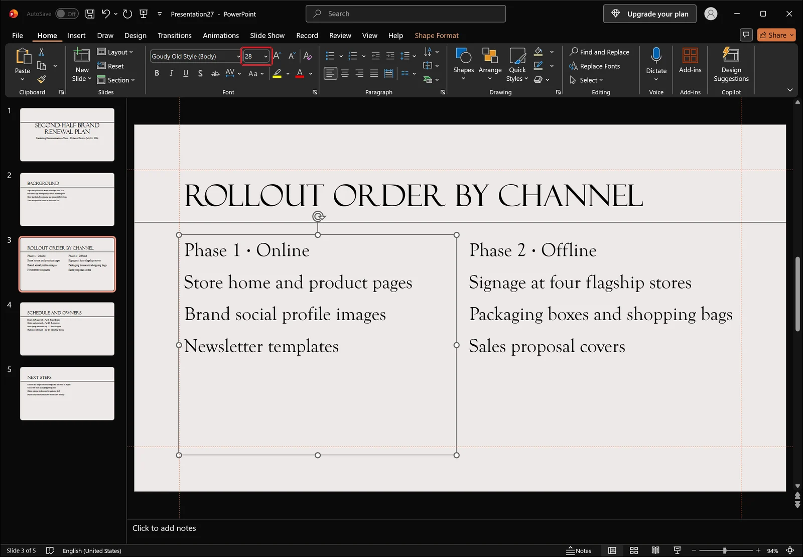
If you are tightening spacing because a bullet will not fit on one line, an oversized Font Size is the faster thing to check. Once the size is reasonable and the line still wraps, that is the moment for a spacing adjustment.
Selecting several objects at once
When a slide has a title and a subtitle in separate boxes, click the first, hold Shift, and click the rest. Any character spacing you then choose is written to all of the selected objects together.
Tighten it fast with Character Spacing on the Home tab
Where the gallery is and what the presets do
The quickest route is the Character Spacing button in the Font group on the Home tab. Select your text, click it, and you get five presets — very tight, tight, normal, loose, very loose — plus a more spacing command at the bottom.
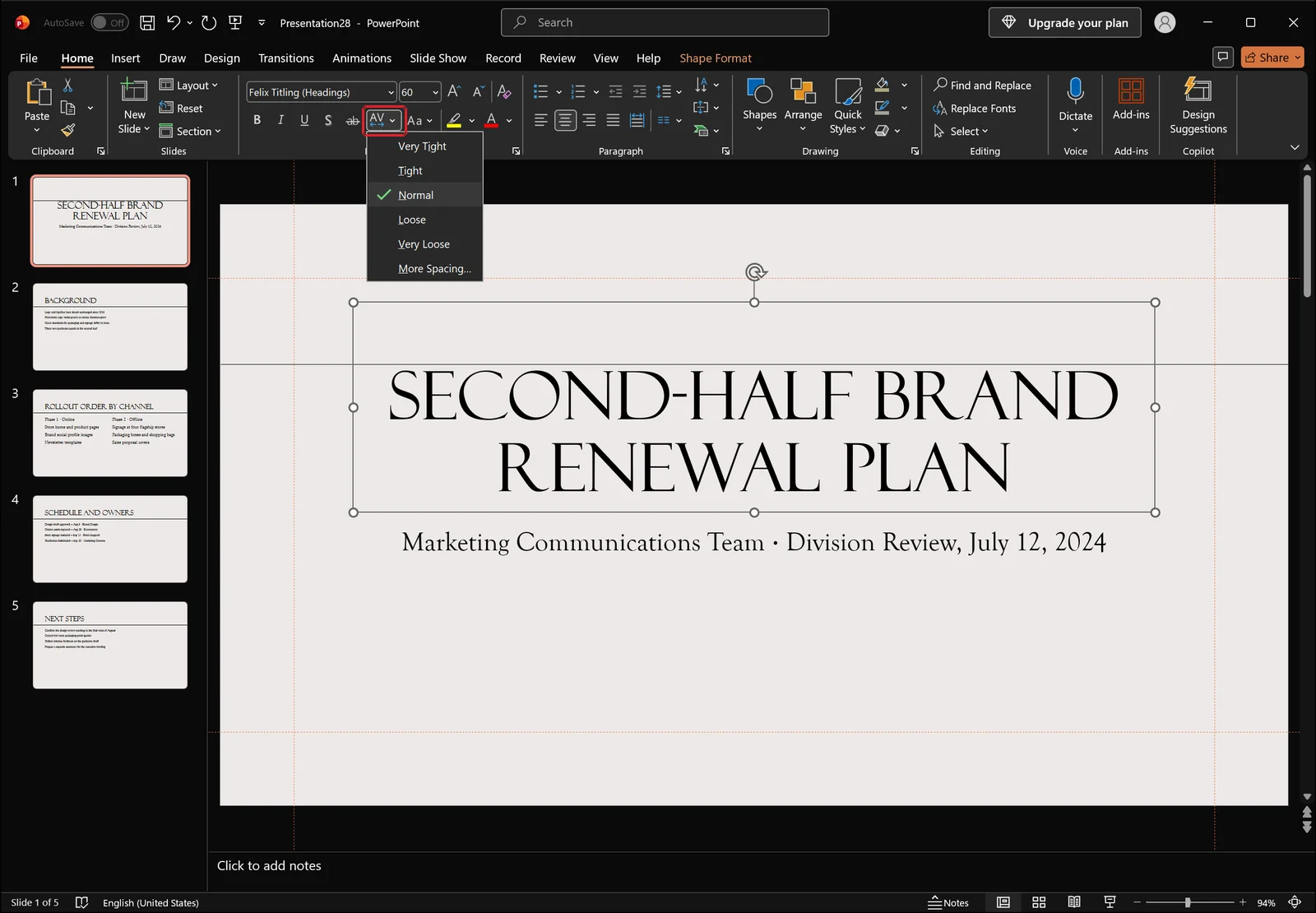
Roughly speaking, very tight is about -1.5pt, tight about -0.75pt, normal is zero, loose about +0.75pt, and very loose about +1.5pt. For anything more precise, the command at the foot of the list takes you to the dialog.
Start titles at tight
For a title of 40pt or more, tight usually settles it in one click. Very tight is a big jump and often pulls letters into each other in display type. If a preset looks cramped, Ctrl+Z immediately and set the value by hand instead.
Body text needs a lighter touch
The same button works on body copy. Select the body placeholder and the identical preset list appears.
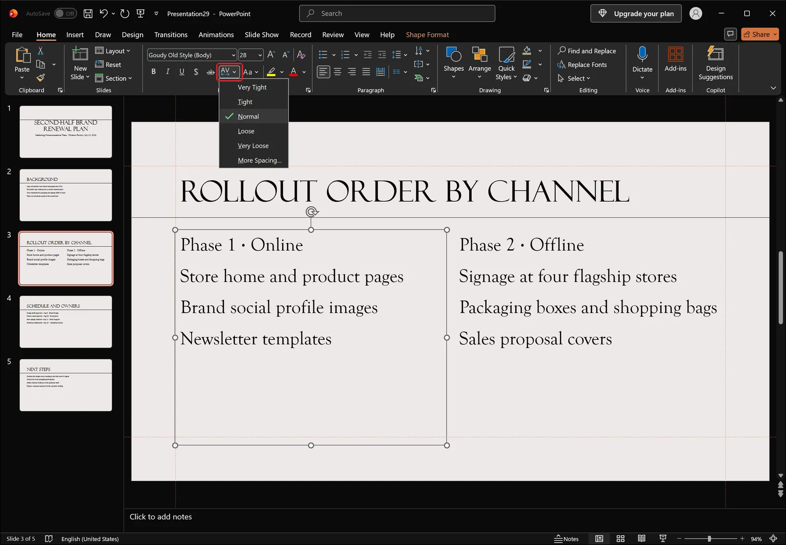
Body text at 14 to 18pt generally gets harder to read when it is tightened, not easier. Leave it on normal, or shave no more than about 0.2pt when a line is only just overflowing.
The target for body text is simple: each bullet on a single line, spacing even throughout. If a line still wraps, shortening the sentence produces a better slide than squeezing the letters.
Set an exact pt value in the Font dialog
Two ways to open it
When no preset fits, type the number yourself. The small arrow at the bottom-right of the Font group on the Home tab opens the Font dialog.
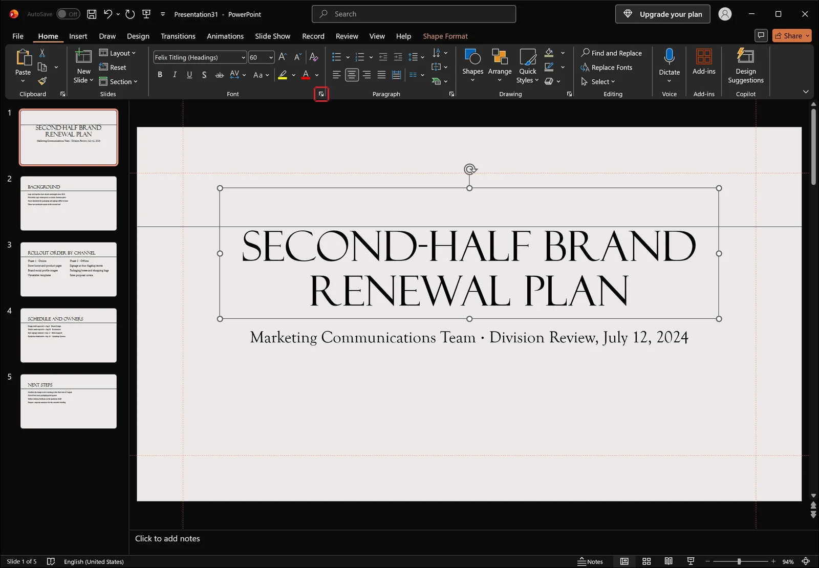
From the keyboard, select the text and press Ctrl+T for the same dialog. The more spacing command at the bottom of the gallery leads here too.
Choosing condensed or expanded and entering the value
The dialog opens on the Font tab, where the typeface, style, size, and effects such as All Caps live.
A Character Spacing tab sits beside the Font tab. Switch to it and you pick Normal, Expanded, or Condensed, then enter a pt figure in the box next to it. It accepts increments of 0.1pt, which is far finer than the presets allow.
Values that hold up in practice: titles of 40pt and above, condensed by 0.5 to 1pt; subheads at 24 to 32pt, condensed by 0.3 to 0.5pt; body text at 14 to 18pt, normal or condensed by no more than 0.2pt. All-caps titles run the other way — expanded by 0.5 to 1pt reads better than the default.
The kerning checkbox
The Character Spacing tab also carries an option to apply kerning above a font size you specify. Switch it on and PowerPoint uses the pair data built into the font to close up combinations like A and V automatically. It is useful when one particular gap in a title looks wrong while the rest is fine, and it has little effect on text where the letterforms are already uniform in width.
Apply the same spacing across every title and body block
Copy it with Format Painter
Once one title is right, the rest of the deck only needs the formatting carried over. Select the text you have already adjusted and click Format Painter in the Clipboard group at the left end of the Home tab.
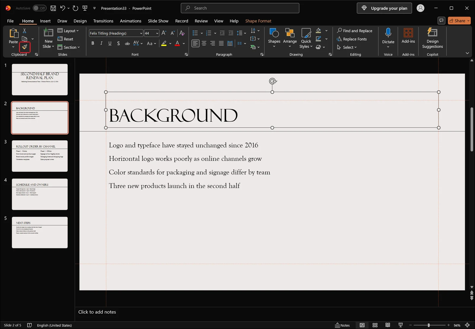
Drag across the target text and the font, size, and character spacing all come with it. To paint several slides in a row, double-click Format Painter, work through the targets, and press Esc when you are done. The keyboard equivalents are Ctrl+Shift+C to copy formatting and Ctrl+Shift+V to apply it.
Fix it in the Slide Master instead
For a deck of thirty or forty slides, setting it once in the master beats painting each one. On the View tab, in the Master Views group, click Slide Master.
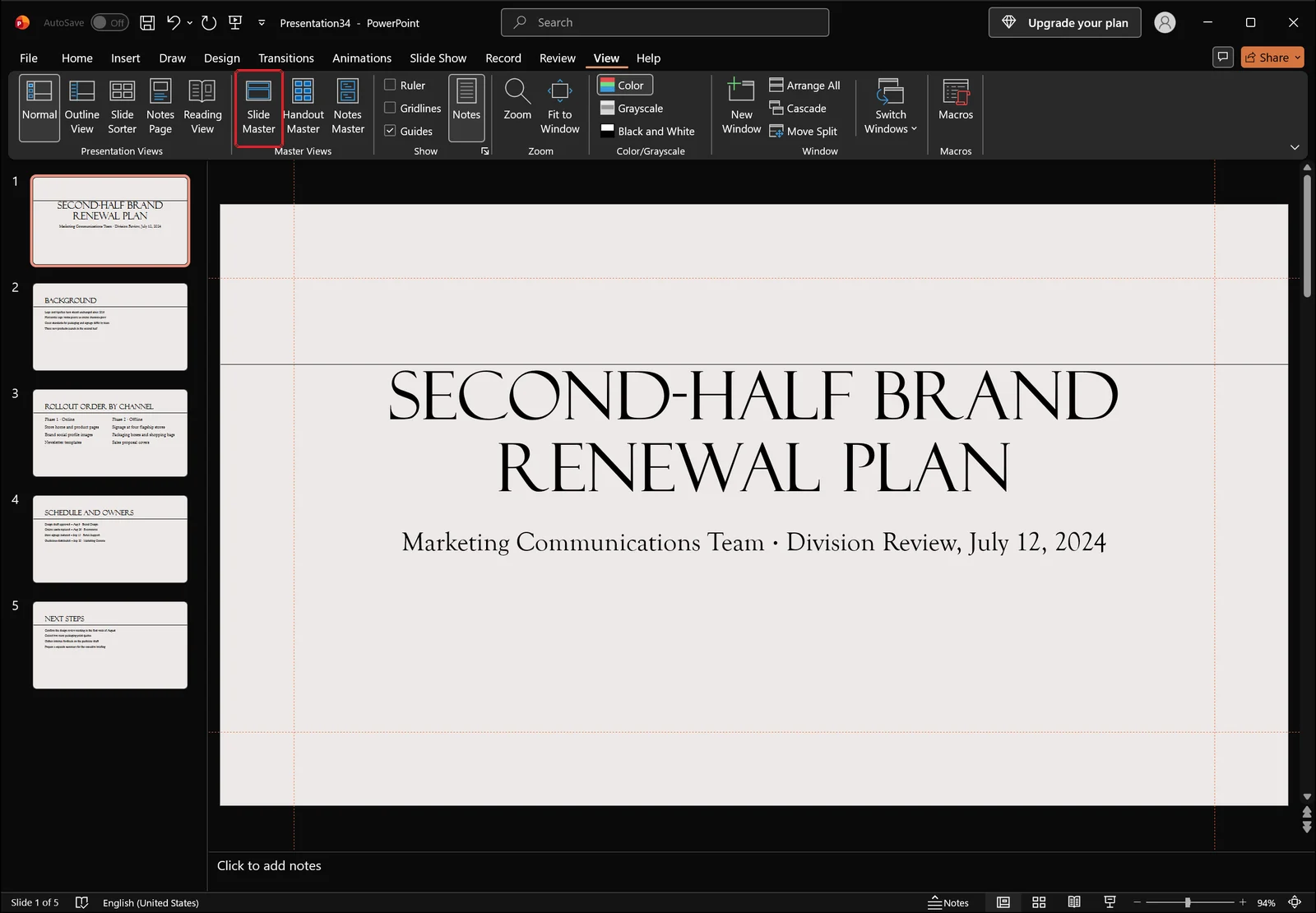
Select the title placeholder in master view, set the character spacing, and close master view. Every slide you add afterwards inherits that value. Slides that already carry direct formatting will not change, since local formatting overrides the master — select those and use Reset on the Home tab to restore the master's formatting first.
👉 How to Use Slide Master in PowerPoint: Format Every Slide
Walk the deck once at the end
When the work is done, page through the slides and look for a title whose spacing still stands apart from the rest. A finished slide looks like this: the title compact and even, the body lines below sharing the same rhythm.
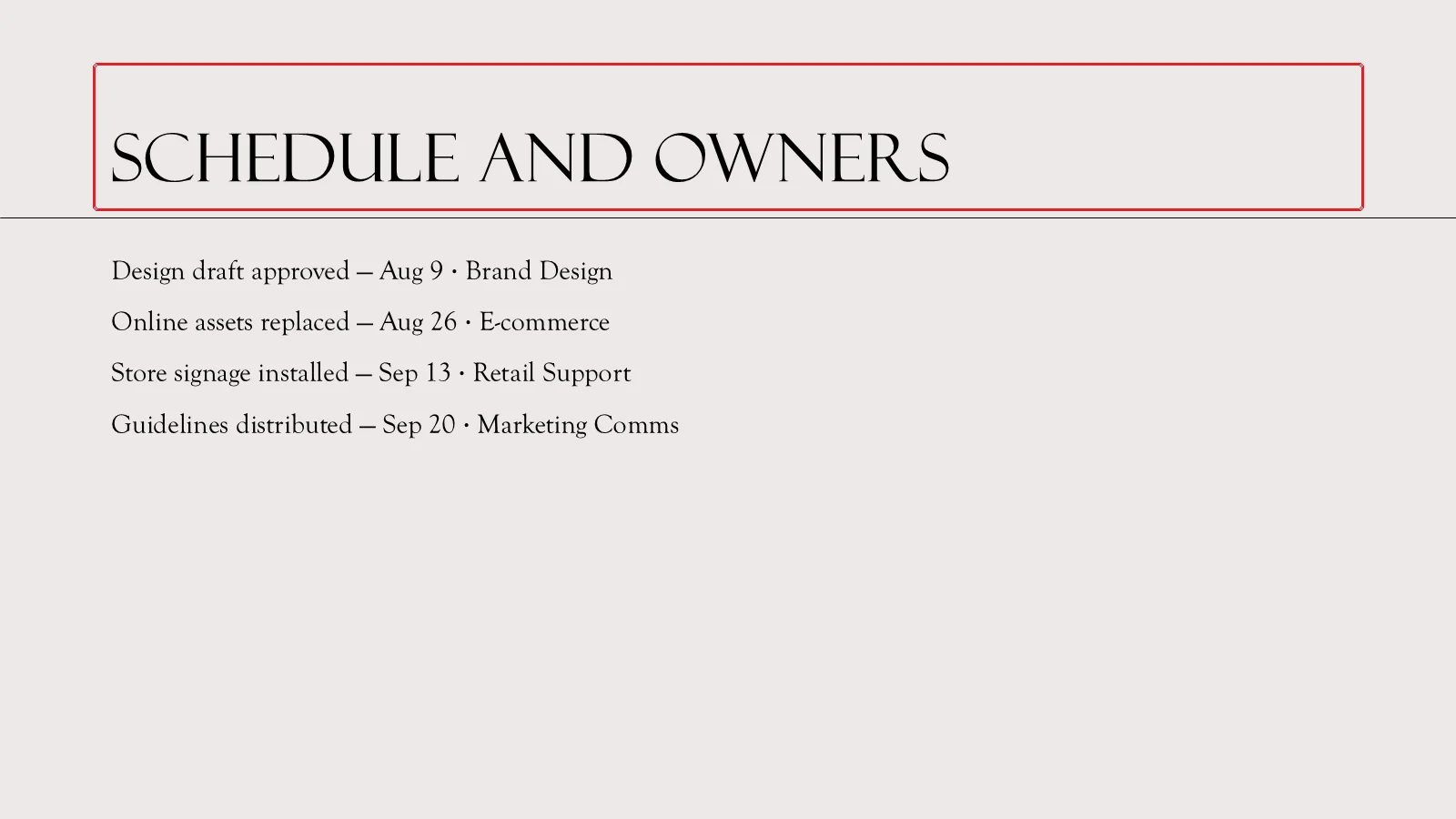
Anything that still looks loose next to its neighbours just needs the same value applied again.
When character spacing does not seem to change anything
The text is a picture, not text
Slide content pasted in as a screenshot is an image. If clicking it gives you a picture border and no text cursor, there is no spacing to adjust — the characters are pixels. Retyping the text is the only route.
Autofit and justified alignment
With autofit on, overflowing text shrinks the font size before anything else happens, so spacing changes get masked by the size bouncing up and down. Justified alignment causes the same confusion from the other direction: the gaps are forced wide to fill the line width. Switch to left alignment, then set the spacing, and the value you enter is the value you see.
👉 Turn Off Autofit Text in PowerPoint: Stop Fonts Shrinking
Reset the formatting and start again
Files that several people have edited tend to carry different fonts, sizes, and spacing stacked paragraph by paragraph. Select the text and click Clear Formatting in the Font group on the Home tab to drop it back to the placeholder default, then rebuild.
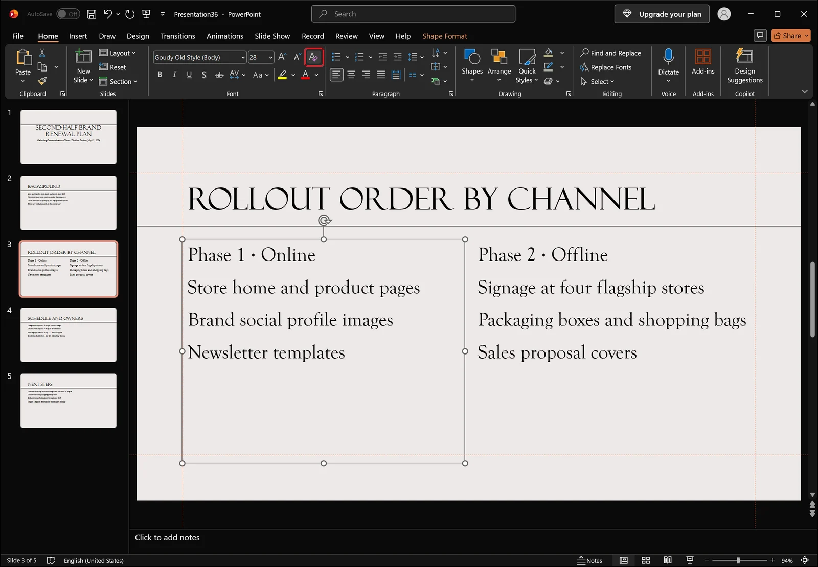
Clearing takes colour and weight with it, so work back in order: font, then size, then spacing.
All-caps titles want more space, not less
A title set entirely in capitals or figures gets worse when you tighten it. Capitals have fairly uniform widths, so closing the gaps turns the line into one solid mass. Sort the capitalisation out with Change Case in the Font group first, then expand the spacing by 0.5 to 1pt.
One thing to note: PowerPoint ships with no keyboard shortcut for increasing or decreasing character spacing. If you use it constantly, add the Character Spacing command to the Quick Access Toolbar and call it with Alt plus a number.
Frequently asked questions
Q. Is there a keyboard shortcut for character spacing in PowerPoint?
Unlike Word, PowerPoint has no built-in shortcut that nudges spacing directly. The practical substitutes are Ctrl+T to open the Font dialog and switch to the Character Spacing tab, adding the Character Spacing command to the Quick Access Toolbar for an Alt-plus-number shortcut, and Ctrl+Shift+C / Ctrl+Shift+V to copy formatting you have already set.
Q. Can I compress the width of the letters themselves?
No. PowerPoint has no percentage-based letter width control. Switching to a narrow face such as Arial Narrow is the simplest answer. For a headline or two, you can also build the text as WordArt or a text box and scale it horizontally as an object.
Q. How much should I tighten a title?
Titles of 40pt and above take 0.5 to 1pt, subheads at 24 to 32pt take 0.3 to 0.5pt, and body text at 14 to 18pt sits best between 0 and 0.2pt. Beyond about 1.5pt of tightening, adjacent letters start touching and legibility drops.
Q. Why did the spacing apply to only part of my text?
Because the value went to the run you had drag-selected. Click the placeholder border so the selection handles show, or put the cursor in the text and press Ctrl+A, then apply the spacing again — it will cover every character in the object.
Tidying slide formatting with inline AI
The gallery and the Font dialog give you exact control, but they work one selection at a time. On a deck of forty slides where titles have picked up different formatting from different authors, the hard part is not setting the value — it is tracking which placeholders you have already been through.
inline AI is a desktop AI agent that works on PowerPoint, Word, and Excel files on your own machine. Ask it to set every title to condensed 0.5pt and it reads the open file, finds the title placeholders across the deck, and applies the change.
Because it processes files locally rather than uploading them, unreleased plans and internal decks stay on your computer.
See what an agent could take over at your company in a 30-minute call.